
Introducing Our Modernized New Website: Built for Prospective Members and Enhanced Member Resources
A website should make the next step easier, not add one more thing to figure out. That belief guided the launch of our new site.
We have modernized our website to better serve two important groups: people who are learning about membership for the first time, and current members who need timely, useful information. The result is a cleaner, more helpful online experience with clearer paths, updated content, and a revised members-only section built around day-to-day value.
The new website is more than a refreshed look. It reflects how people actually search for information, compare membership benefits, find resources, and stay connected with an organization. Prospective members can now get a better sense of who we are and what membership offers. Current members have a dedicated space designed to support their ongoing needs.

Why we modernized the website
Websites age quickly. Navigation that once felt simple can become crowded. Pages can grow uneven over time. Important information can get buried under older updates. For a membership-based organization, that creates two common problems.
First, prospective members may not understand the full value of joining. They might land on a page, look for answers, and leave if the path is not clear. They need a straightforward way to learn about the organization, understand benefits, and decide whether membership is a good fit.
Second, current members may need dependable access to information that supports their connection with the organization. That may include updates, resources, guidance, documents, event details, or member-specific news. If those items are scattered, members spend more time searching and less time using what they came for.
Our modernized website addresses both needs. It offers a more welcoming public experience and a more useful private member experience. The goal is simple: make the website easier to use, easier to trust, and easier to return to.
This launch also gives us a stronger foundation for future updates. A good website should not stand still. It should grow with the organization, reflect member priorities, and help people find current information without confusion.
A better experience for prospective members
Prospective members often arrive with practical questions.
They want to know what the organization does. They want to understand who membership is for. They want to see whether the benefits match their interests, goals, or professional needs. They may also want to know how to join, what happens after joining, and how membership connects them to a broader community.
The new website is built with those questions in mind.
Instead of expecting visitors to already know where to go, the site gives clearer direction. Public-facing content has been shaped to help prospective members move naturally from discovery to decision. That means fewer dead ends and a better explanation of what membership offers.
A prospective member should be able to answer several key questions without searching through unrelated pages:
What does the organization stand for?
Who can become a member?
What are the main benefits of membership?
What resources or opportunities are available?
How does someone take the next step?
By putting these answers closer to the surface, the website gives visitors more confidence. It also helps set realistic expectations before someone joins. That matters because a strong membership experience begins before the application or sign-up process. It begins with clear information.
Clearer paths to membership information
The new site gives membership content more focus. Rather than treating membership as a small section of a larger website, it places membership information where prospective members can see it and understand it.
That includes clearer wording, more direct navigation, and a stronger connection between public content and the value of joining. When someone is deciding whether to become a member, every click should help them learn something useful.
The public side of the website now works more like a guided introduction. It does not assume prior knowledge. It explains, points, and supports.
A more welcoming first impression
Design matters because it affects trust. A modern website signals that the organization is active, attentive, and ready to serve. Clean pages, readable text, and simple navigation all help visitors feel more comfortable.
The new website was designed to feel current without becoming complicated. A site can look modern and still be easy to use. That balance is especially important for a membership organization serving people across different backgrounds, locations, and levels of familiarity.
Prospective members should not need special knowledge to understand the site. They should be able to browse, learn, and take the next step with confidence.

A revised members-only section with more value
While the public side of the site helps people learn about membership, the revised members-only section focuses on supporting those who are already part of the organization.
Members need more than general information. They need content that is relevant, timely, and easy to access. The members-only section has been revised to provide a more useful home for member resources and updates.
This private section is intended to become a dependable place for members to return to throughout the year. It gives the organization a clearer way to share information that matters specifically to members, while also helping members find what they need without sorting through public-facing pages.
The members-only area may include resources such as:
Member updates and announcements
Reference materials and guidance
Event-related information
Forms, documents, or helpful links
News intended only for members
Information that supports participation and engagement
The exact content may change over time, but the purpose remains the same. The section is built to provide valuable information to our members in a place that is easier to maintain and easier to use.
A central place for member information
One of the biggest advantages of a revised members-only section is focus. Members should know where to go when they need information tied to their membership.
When member resources are spread across emails, old pages, attachments, and announcements, it can be hard to keep track of what is current. A dedicated members-only section gives important information a stronger home.
That does not mean every member will use the site in the same way. Some may visit often. Others may log in only when they need a specific item. The revised section supports both habits by making the most useful information easier to locate.
Better support for ongoing communication
A members-only section also helps communication feel more organized. Instead of relying only on one-time messages, the website can serve as a reference point. Members can return to it when they need to check details or find materials.
This is especially helpful for a nationwide membership base. Members may be in different locations and time zones. They may access information at different times and from different devices. A well-organized member area reduces friction and gives people more control over when and how they find information.
What has changed on the new site
The website now reflects a more user-focused approach. That means the structure, content, and design all work together to make information easier to find.
Some of the most meaningful changes include:
Before
Information could feel harder to locate as the site grew.
Before
Prospective members had to piece together the value of membership.
Before
Member-specific content may not have felt as complete or central.
Before
The design reflected an earlier version of the organization’s online presence.
Now
Pages are organized around clearer paths and common needs.
Now
Membership information is easier to understand and explore.
Now
The revised members-only section gives members a stronger resource hub.
Now
The site feels more current, readable, and accessible.
These changes may seem simple on the surface, but they have a real impact. Good navigation saves time. Clear writing reduces confusion. A more organized structure helps both new visitors and long-time members.
A website should meet people where they are. Someone exploring membership for the first time needs a different path than someone looking for a member resource. The new site recognizes that difference.
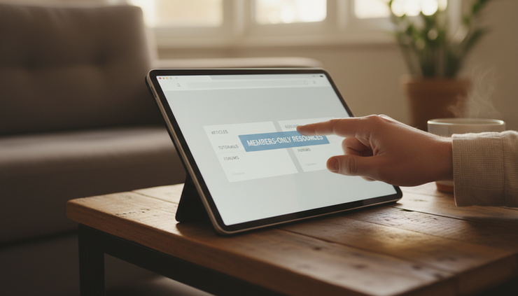
How members can use the revised section
The revised members-only section is designed to become part of the member experience, not just an occasional stop.
Members can use it to stay informed, look up key materials, and access information that supports their involvement. Over time, it can also help reduce repeated questions by giving members a reliable place to check first.
Here are a few practical ways the section can help:
Finding current information
Members can look for updates in one dedicated area rather than searching across multiple sources. This helps prevent confusion, especially when information changes.
Accessing member resources
Documents, links, and reference materials can be housed in a space that members know is intended for them. That makes the section useful for both new and returning members.
Staying connected
Member-only updates can help people feel more connected to the organization’s work, priorities, and opportunities to participate.
Supporting self-service
When common resources are easy to find, members can get answers more quickly. That improves the experience for members and helps the organization communicate more clearly.
The revised section will be most valuable when members make it part of their regular routine. Checking it periodically can help members stay current and take full advantage of available resources.
Built with future updates in mind
A website launch is a milestone, but it is also a starting point. The new site gives us a better foundation for continued improvement.
As the organization grows and member needs change, the website can grow too. Public pages can be updated to answer new questions from prospective members. Member-only resources can be expanded, refined, and refreshed as new information becomes available.
That flexibility matters. A useful website is not only about how it looks on launch day. It is about whether it can keep serving people well months and years later.
We also know that feedback plays an important role. Members and visitors often notice where an explanation could be clearer or where a resource could be easier to find. That feedback can help guide future improvements, especially in the members-only section.
The best version of the site will come from continued use. As people browse, search, log in, and return, the website will become a stronger tool for communication and connection.
What this launch means for our community
This new website supports a simple but important goal: helping people connect with the right information at the right time.
For prospective members, that means a clearer introduction to the organization and the value of joining. For current members, it means a more useful private section with resources and updates designed for them.
The launch also reflects a broader commitment to service. Members deserve information that is accessible, current, and easy to use. Prospective members deserve a welcoming first experience that helps them understand whether membership is right for them.
A modern website cannot replace personal connection, shared purpose, or member participation. It can support all of those things. It can remove barriers, answer common questions, and make it easier for people to take part.
That is why this update matters.

A stronger online home for members and future members
Our modernized new website was built with purpose. It gives prospective members a clearer way to learn about the organization, and it gives current members a revised members-only section with more useful information in one place.
This launch is an important step, but the real value will come from how the site is used. We encourage members to explore the revised section, become familiar with the resources available, and return often for updates. We also welcome prospective members to use the new site as a starting point for learning more about who we are and what membership offers.
A better website should make connection easier. That is what this new site is designed to do.
Comments